Color Theory
Color spaces, harmony, and fundamentals for digital artists.
What is Color Theory?
Color theory is the study of how colors interact, combine, and affect human perception. For digital artists, animators, and creative professionals, understanding color theory is essential for creating visually compelling work.
In digital applications like DeltaSketch, color theory informs everything from basic color picker design to advanced color grading workflows, palette generation, and real-time color effects.
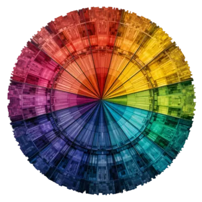
The Color Wheel
The color wheel is the foundation of color theory. It organizes colors by their relationships:
Primary Colors
Red, yellow, and blue (in traditional art) or red, green, blue (in light/digital). Cannot be created by mixing other colors. All other colors derive from these.
Secondary Colors
Created by mixing two primary colors: orange (red+yellow), green (yellow+blue), purple (blue+red). Sit between primaries on the wheel.
Tertiary Colors
Created by mixing a primary with a secondary: red-orange, yellow-orange, yellow-green, blue-green, blue-purple, red-purple. Expand the color wheel to 12 colors.
Color Harmony
Color harmony describes combinations of colors that are aesthetically pleasing. Common harmonious schemes include:
- Complementary: Colors opposite each other on the wheel (red/cyan, blue/yellow). High contrast, vibrant. Use one as dominant, the other as accent.
- Analogous: Colors adjacent on the wheel (red, red-orange, orange). Harmonious, low contrast. Common in nature. Creates cohesive, comfortable designs.
- Triadic: Three colors evenly spaced (red, yellow, blue). Vibrant and balanced. One dominant, two accents works well.
- Split-complementary: A color plus the two adjacent to its complement. High contrast but less tension than pure complementary.
- Monochromatic: Variations in lightness and saturation of a single hue. Elegant, cohesive. Easy to execute well.
- Tetradic (double complementary): Two complementary pairs. Rich, complex. Requires careful balance to avoid chaos.
Color Properties
Every color has three fundamental properties:
Hue
The pure color itself: red, orange, yellow, green, blue, violet. Measured in degrees around the color wheel (0° = red, 120° = green, 240° = blue).
Saturation
The intensity or purity of the color. 100% saturation is pure hue; 0% is gray. Highly saturated colors are vivid; low saturation is muted or pastel.
Value / Lightness
The brightness of the color. Black (0%) to white (100%). Adding white creates tints; adding black creates shades. Value is critical for depth and dimension.
Color Spaces
Color spaces are mathematical models that describe how colors can be represented. Different spaces are optimized for different uses:
| Color Space | Components | Use Case |
|---|---|---|
| RGB | Red, Green, Blue | Screens, digital displays, web |
| HSV / HSL | Hue, Saturation, Value/Lightness | Color pickers, intuitive editing |
| CMYK | Cyan, Magenta, Yellow, Key (black) | Print, professional printing |
| Lab | Lightness, a (green-red), b (blue-yellow) | Perceptually uniform, color correction |
| YCbCr | Luma, Blue-difference, Red-difference | Video, image compression (JPEG) |
| XYZ | CIE XYZ tristimulus values | Color science, device-independent |
RGB Color Model
RGB (Red, Green, Blue) is the primary color model for digital displays. Screens emit light, and colors are created by combining red, green, and blue light at varying intensities:
- Additive mixing: Combining light adds colors. Red + green = yellow; red + green + blue = white.
- 8-bit per channel: Values 0–255 per channel. 24-bit total = 16.7 million colors. Standard for web and most displays.
- Higher bit depth: 10-bit (0–1023) or 16-bit per channel for professional work. Reduces banding, enables HDR.
- sRGB: Standard RGB color space for web and consumer displays. Limited gamut but universally supported.
- Adobe RGB: Wider gamut than sRGB. Used in professional photography and print. Requires wide-gamut displays.
- DCI-P3: Cinema standard. Wider than sRGB, used in modern displays and video. Common in high-end monitors and mobile devices.
- Rec. 2020 / BT.2020: Ultra-wide gamut for 4K/8K HDR content. Future of consumer displays.
HSV / HSL Color Model
HSV (Hue, Saturation, Value) and HSL (Hue, Saturation, Lightness) are cylindrical color models that are more intuitive for humans than RGB:
- Hue: The color type (0–360°). Rotate around the cylinder to change color.
- Saturation: Distance from center. 0% = gray, 100% = pure color.
- Value (HSV): Height in the cylinder. 0% = black, 100% = full brightness.
- Lightness (HSL): 0% = black, 50% = pure color, 100% = white. More intuitive for lightening/darkening.
HSV/HSL is used in color pickers because it maps better to how humans think about color: "I want a brighter blue" or "a more saturated red."
Color Psychology & Emotion
Colors evoke emotional responses and carry cultural meanings. Understanding this helps artists communicate through their work:
Red
Passion, energy, danger, love. High visibility. Grabs attention. Can increase heart rate. Use for warnings, highlights, emotional intensity.
Blue
Calm, trust, professionalism, sadness. Cool and stable. Common in corporate and tech. Dark blue = authority; light blue = serenity.
Green
Nature, growth, harmony, freshness. Easy on the eyes. Dark green = wealth; bright green = energy; olive = earthiness.
Yellow
Happiness, optimism, caution, warmth. Most visible color. Can cause eye fatigue in large areas. Use for highlights and attention.
Purple
Royalty, luxury, mystery, creativity. Historically expensive to produce. Dark purple = richness; light purple = whimsy, magic.
Orange
Energy, enthusiasm, warmth, affordability. Friendly and inviting. Combines red's energy with yellow's cheer. Great for call-to-action.
Color in Digital Art & Animation
Palette Design
A well-chosen palette unifies a piece and guides the viewer's eye. Strategies include:
- Limited palette: Use 3–5 colors. Forces cohesion and creativity. Common in illustration and animation.
- Dominant color: One color occupies 60% of the image. Secondary (30%) and accent (10%) support it.
- Color scripting: Plan color progression across an animation or film. Each scene has a color mood that supports the story.
- Contrast: Use color contrast to direct attention. Warm colors advance; cool colors recede.
Color Grading
Color grading is the process of altering or enhancing color in post-production. In video and animation:
- Primary grading: Overall color balance, exposure, contrast. Corrective and foundational.
- Secondary grading: Adjust specific colors or regions. Make skies bluer, skin tones warmer, etc.
- LUTs (Look-Up Tables): Pre-defined color transforms. Apply cinematic looks quickly. Common in video editing and games.
- Creative looks: Stylized color treatments: teal & orange, bleach bypass, vintage film, cross-processing.
Color Accessibility
Ensuring your work is accessible to all viewers, including those with color vision deficiencies:
- Contrast ratios: WCAG guidelines recommend minimum 4.5:1 for normal text, 3:1 for large text. Use tools to check.
- Color blindness: ~8% of men and 0.5% of women have some form of color vision deficiency. Don't rely on color alone to convey information.
- Patterns & shapes: Supplement color with texture, patterns, labels, or icons. Ensures information is accessible.
- Simulation tools: Use color blindness simulators (like Color Blindly for Figma) to test your designs.
Color Tools & Resources
Adobe Color
Create color palettes based on harmony rules. Explore trending palettes. Extract themes from images. Integrates with Creative Cloud.
Coolors
Fast palette generator. Lock colors, generate variations, export to multiple formats. Great for quick exploration and inspiration.
Paletton
Advanced color scheme designer. Preview palettes on mockups. Export in various formats. Based on color theory principles.
ColorZilla
Browser extension for picking colors from any webpage. Gradient generator, color history, and palette extraction. Essential for web and UI work.
Getting Started with Color
To improve your color skills:
- Study the color wheel and learn to identify primary, secondary, and tertiary colors
- Practice color mixing: use a limited palette and create a range of tints, shades, and tones
- Learn to see color temperature: warm vs. cool, and how it affects mood and depth
- Study master artists and analyze their color choices: why did they use that palette?
- Practice color harmony exercises: create images using complementary, analogous, and triadic schemes
- Learn your software's color tools: pickers, adjustment layers, curves, levels, color balance
- Experiment with color grading in video or animation software
- Use color theory in DeltaSketch: apply color effects, create palettes, grade your time-lapses
Common Color Mistakes
- Too many colors. Limit your palette. More colors don't make better art; they create visual noise.
- Ignoring value. Value (lightness) is more important than hue. A painting with good values works even with wrong colors.
- Flat colors. Add variation within color areas: highlights, shadows, reflected light. Flat colors look lifeless.
- Clashing complements. Complementary colors are powerful but can vibrate uncomfortably if used at full saturation equally. Use one as dominant.
- Forgetting context. Colors look different depending on surrounding colors. A gray looks different on white vs. black. Test your palettes in context.
- Neglecting accessibility. Ensure sufficient contrast for text and important elements. Check with color blindness simulators.